
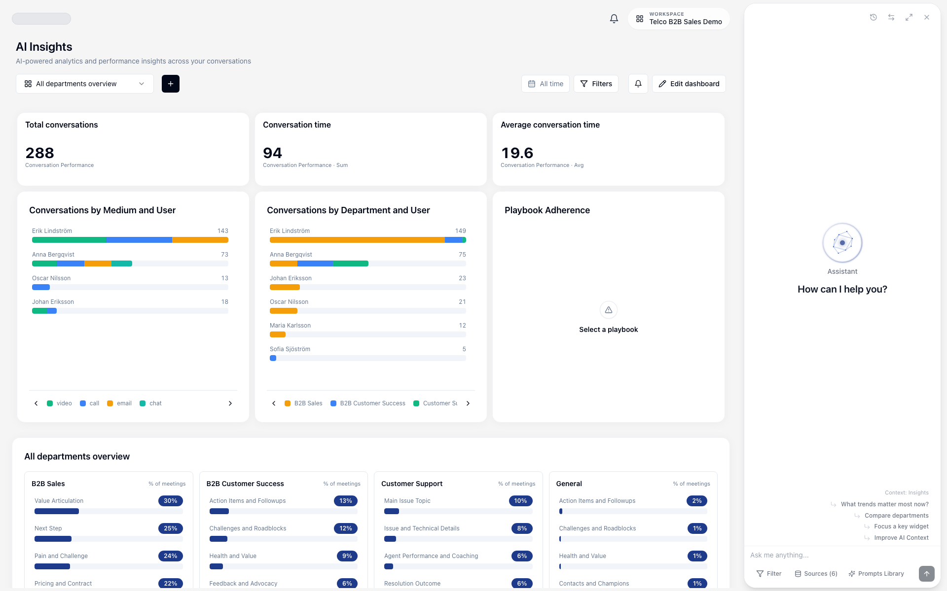
Insights Dashboard
Transform your conversation data into actionable insights. Track KPIs, analyze trends, identify patterns and make data-driven decisions with Meetric's powerful analytics dashboard.
Dashboard Overview#
The Insights Dashboard aggregates data across all your conversations to provide a comprehensive view of your business metrics, customer sentiment and team performance.
KPI Tracking
Monitor key metrics in real-time
Trend Analysis
Spot patterns over time
Team Performance
Track individual and team metrics
Custom Views
Create personalized dashboards
Accessing the Dashboard#
Access Insights from the main product navigation:
- Main Navigation: Click Insights in the left sidebar
- Desktop Experience: Insights is optimized for desktop and shows a desktop-required notice on mobile
- Dashboard Picker: Switch between all-departments, department dashboards and custom dashboards

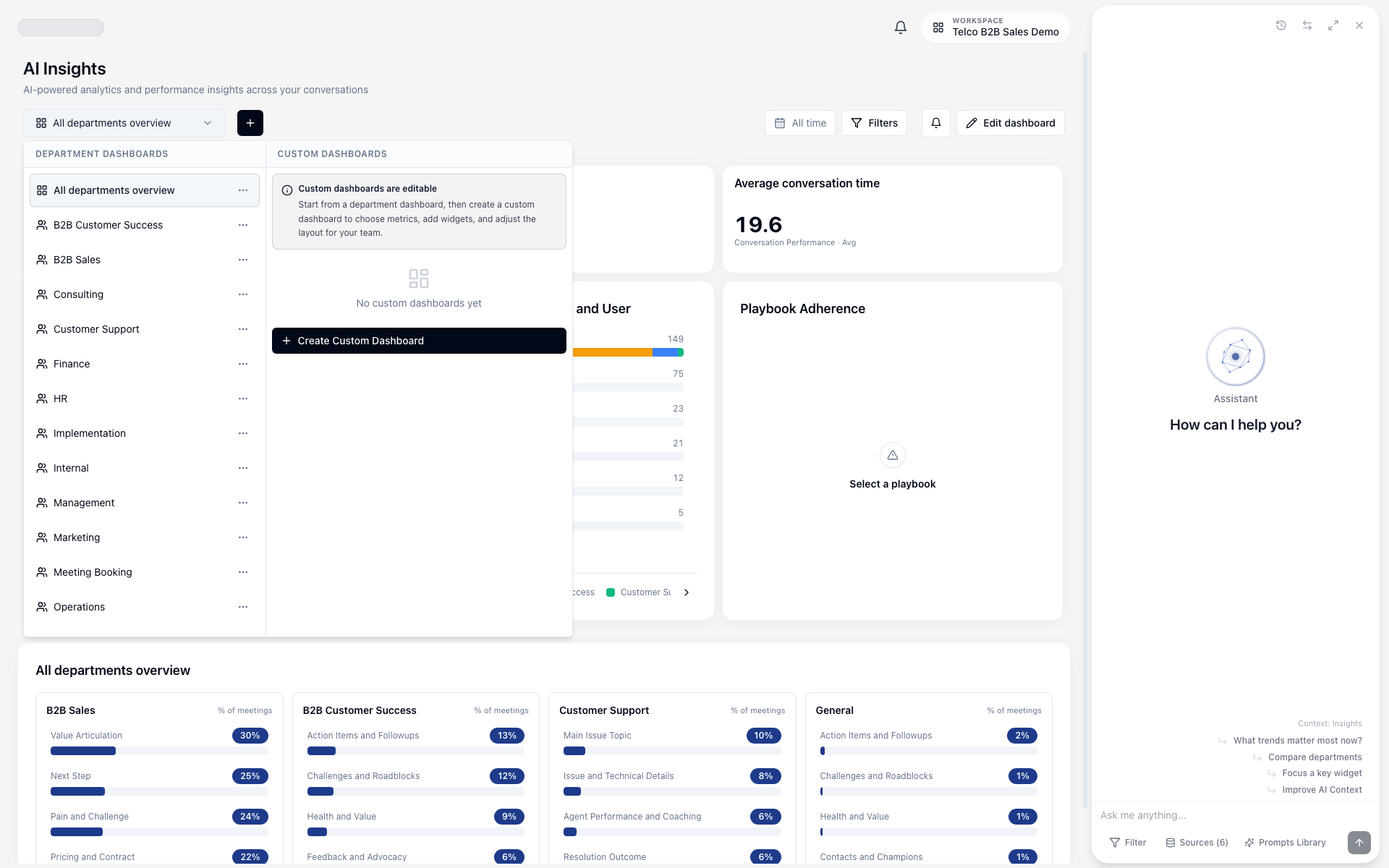
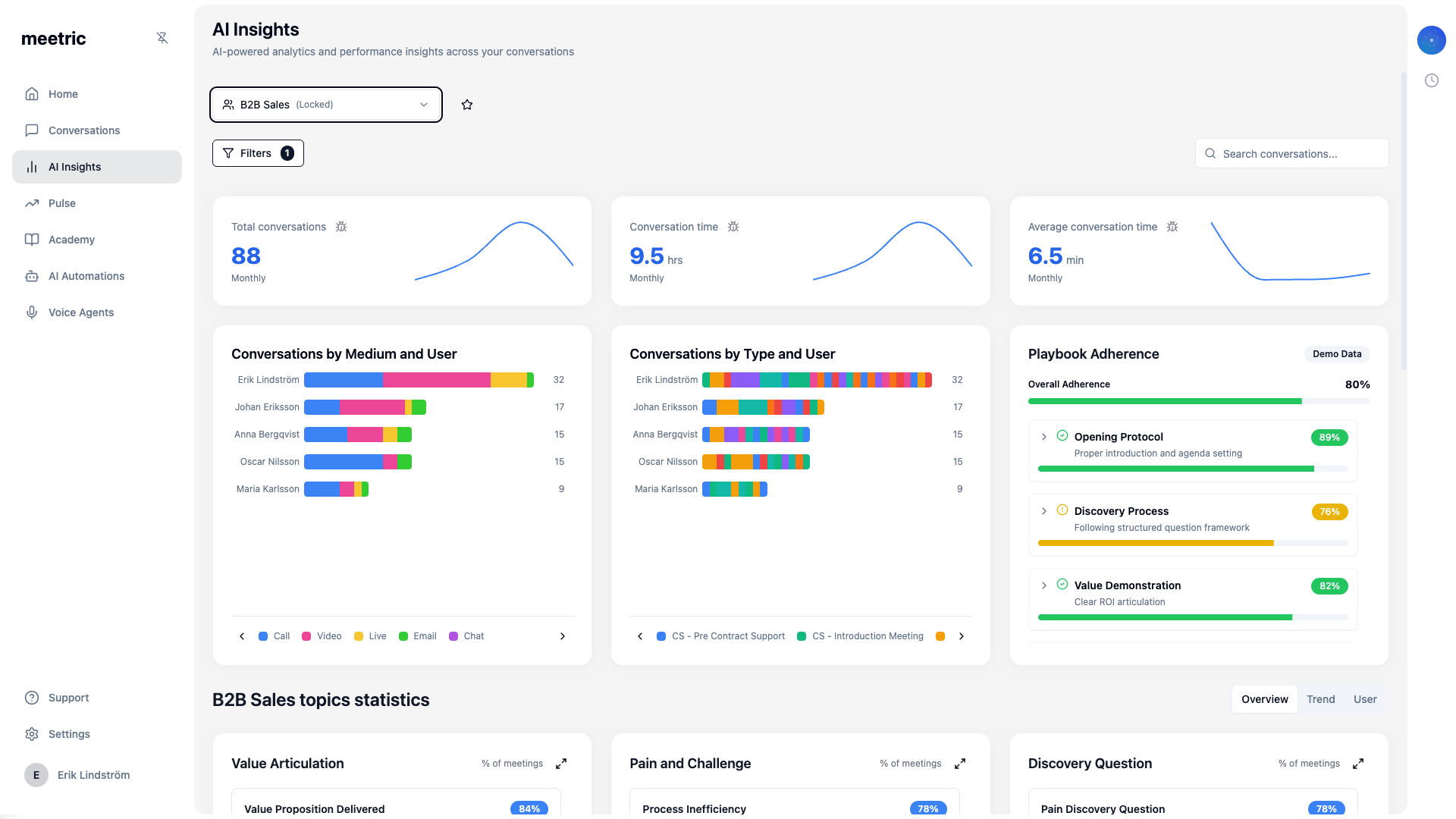
Dashboard Layout#
The dashboard is organized into several key sections:
Header Bar
- • Dashboard selector
- • Filters button
- • Report subscription button
- • Custom dashboard actions
KPI Cards
- • Total conversations
- • Conversation time (hours)
- • Average conversation time (minutes)
- • Period-over-period trend indicators
Visual Panels
- • Conversations by medium and user
- • Conversations by type or department
- • Playbook adherence (department view)
- • Department-specific predictive widgets
Insight Views
- • Overview
- • Trend
- • User
- • Drill-down into contributing conversations
KPIs & Metrics#
Key Performance Indicators provide at-a-glance insights into your most important metrics.
Default KPIs#
The dashboard highlights core account or department metrics automatically:
Total Conversations
Number of recorded and uploaded conversations
Conversation Time (Hours)
Total conversation time in hours
Average Conversation Time (Minutes)
Average duration per conversation
Custom KPIs#
Build custom dashboards with widgets tailored to your team:
- Open the dashboard selector and click Create Custom Dashboard
- Name your dashboard and save
- Use Add Widget to choose the widget type and metric source:
- Insights, trackers, AI fields, playbooks or conversation performance sources
- Aggregation and breakdown dimensions
- Date range and filter scope
- Edit, duplicate, remove and rearrange widgets while in edit mode
- Save dashboard changes
1. Create dashboard: "Sales QBR Overview"
2. Add Widget -> Metric Card -> Source: Insights -> Category: objection
3. Add Widget -> Trend Chart -> Source: Conversation Performance -> Metric: total conversations
4. Add Widget -> Leaderboard -> Source: Playbooks -> View by: user
5. Save dashboard and subscribe recipients from the bell iconTip
KPI Alerts & Notifications#
Use report subscriptions to deliver recurring dashboard snapshots:
Dashboard Subscription
Subscribe recipients to a selected dashboard with current filters
Schedule
Set daily or weekly delivery with day/time and timezone
Recipients
Send to selected account members

Trend Analysis#
Visualize how metrics change over time to identify patterns, seasonality and anomalies.
Available Charts#
Overview View
Category-level insight cards and drill-down entry points
Best for: Scanning what happened in a selected department
Trend View
Time-series view for selected insight dimensions
Best for: Watching change over time
User View
Breakdown by user performance and contribution
Best for: Coaching and ownership analysis
Conversation Charts
Medium/user and type/department chart panels
Best for: Cross-team and channel-level distribution
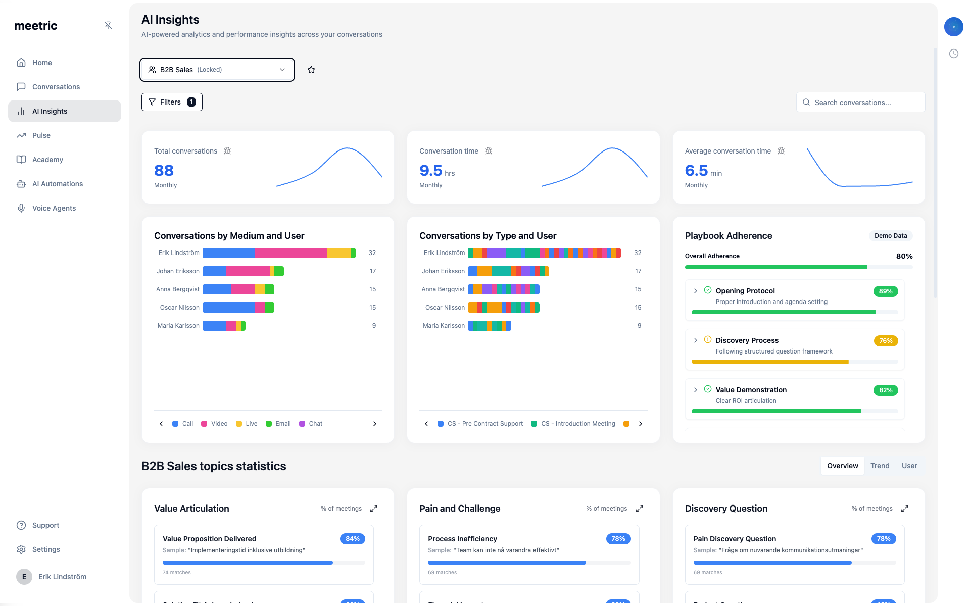
Analysis Features#
Interactive capabilities available in the current dashboard:
- View Modes: Switch between Overview, Trend and User views inside department dashboards
- Drill-down: Open conversation-level evidence for selected insight entries
- Department Focus: Jump from all-departments overview into a specific department dashboard
- Filter Context: Keep analysis scoped with the same filter set across widgets and views
Note
Common Trend Analyses#
Conversation Volume Trends
Track total conversation count over time
Topic Evolution
How discussion themes change over time
Sentiment Trajectory
Customer satisfaction trends
Performance Metrics
Team and individual performance over time
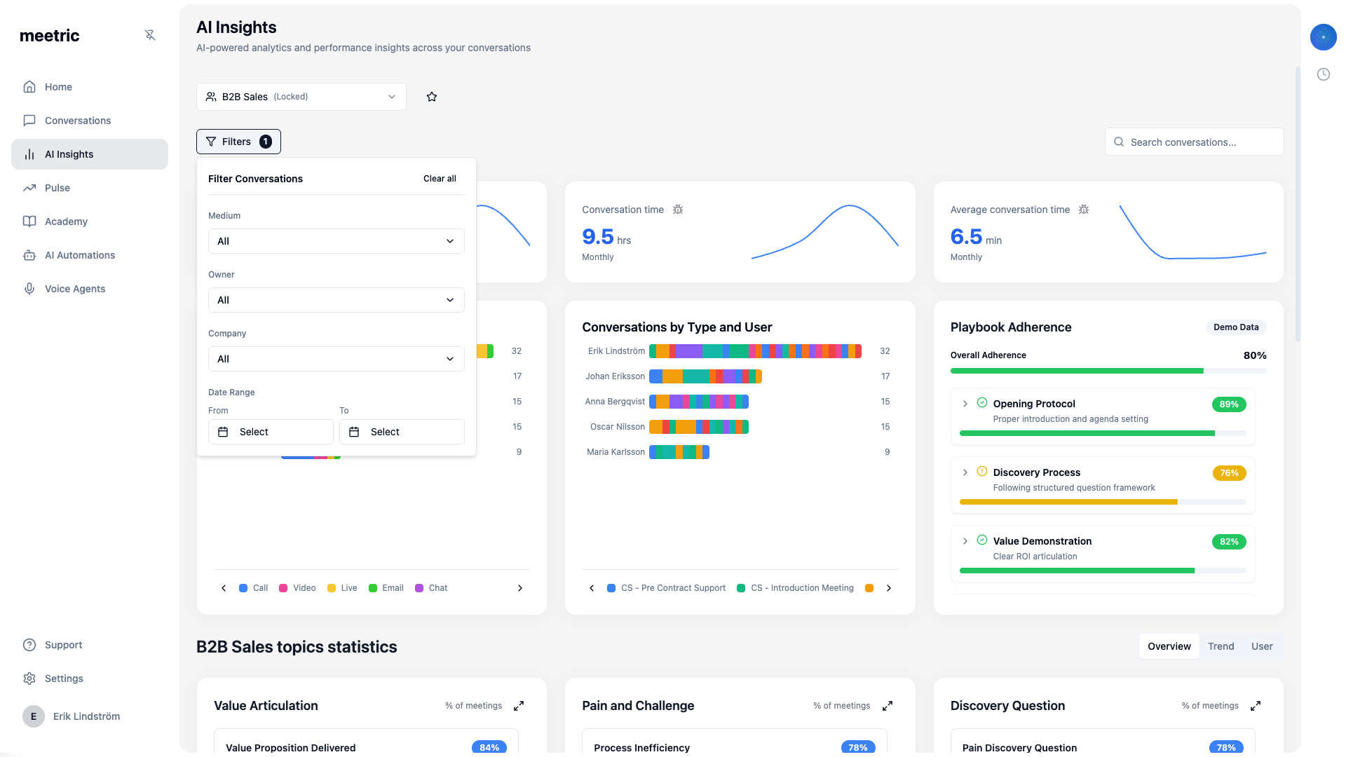
Using Filters#
Filters let you slice and dice your data to focus on specific segments.
Date Range Selection#
Use the filter panel to set your analysis window:
Or create a custom range:
- Click the date range selector
- Pick start and end dates
- Apply the filter
- Review KPI cards, charts and insights under the same date scope
Tip
Dimension Filters#
Filter by conversation and analysis dimensions:
Medium
Compare channels and communication types
Privacy and Ownership
Limit results by visibility, people and accounts
Department
Scope dashboards to organization structure and workflow type
Insight Dimensions
Analyze specific insight categories and extracted values
Saved Audiences
Reuse consistent filter definitions across reporting workflows
Saved Views#
Save frequently used filter combinations as views:
- Apply your desired filters
- Click "Save View"
- Name your view (e.g., "Enterprise Q1 Performance")
- Choose visibility (Personal or Shared with team)
- Access saved views from the Views dropdown
Note
Department Views#
Use department dashboards to review insights with team-specific context.
Pre-Built Department Dashboards#
- Each department card shows top KPI categories for that department
- Use See full dashboard to open the full department-specific dashboard
- If a department has no users/data yet, the card shows setup prompts (for example invite users)
Tip
Cross-Department Analysis#
Compare metrics across departments to identify best practices:
- Conversation Duration: Which team has most efficient calls?
- Sentiment: Which department has happiest customer interactions?
- Action Item Completion: Who follows through best?
- Topic Overlap: Where do departments discuss similar themes?
Export & Sharing#
Share recurring dashboard updates through report subscriptions.
Export Options#
Dashboard Subscription
Scheduled report delivery for a selected dashboard and filter set
Use case: Regular stakeholder updates
- Configure your dashboard with desired filters and date range
- Click the Subscribe (bell) action in the dashboard header
- Choose schedule details and recipients
- Save the subscription
Scheduled Reports#
Automate recurring reports to keep stakeholders informed:
- Set up your dashboard view with filters
- Click Subscribe from the dashboard header
- Configure schedule:
- Frequency (Daily or Weekly)
- Day/time to send
- Recipients (account members)
- Save subscription
# Executive Weekly Digest
Frequency: Every Monday at 8 AM
Recipients: selected account members
Content: selected dashboard with current filters

# Support Monthly Review
Frequency: Weekly on Friday
Recipients: support leads in account
Content: support-focused dashboard snapshot

# Sales Daily Standup Metrics
Frequency: Weekdays at 9 AM
Recipients: sales managers in account
Content: sales dashboard with daily cadence
Note
Dashboard Sharing#
Current sharing options in Insights focus on scheduled subscriptions:
- Dashboard subscriptions: Send recurring updates to selected account members
- Filter-aware delivery: Subscription payload respects current dashboard and filter context
- Operational handoff: Use subscriptions for recurring leadership or team reporting cadences
Next Steps
You're ready to leverage insights! Here's what to explore next: